The Earth has, and has always had, approximately 9.25 million trillion gallons of water, of which 97 percent is salt water. As world populations grow, the need to reuse water, and thus to treat it, will continue to grow.
Geographic reference: World
Year: 2008
Market size: $44.6 Billion
Source: “World Treatment Products,” November 2009, p. NA [Online] here.
Author: admin
Size of the Foodservice Disposables Market
This category includes all the many disposable items used by restaurants and fast food establishiments: dishes, cups, aprons, trays, etc.
Geographic reference: World
Year: 2008
Market size: $40.5 Billion
Source: “World Foodservice Disposables,” November 2009, p. NA [Online] here.
Size of the Drive-in Movie Market
While drive-in movies have declined greatly since their heyday in the mid-1950s, when 5,000 such theaters were operated, there has been some small growth in the industry since the 1990s. In 2007, 6 new drive-in theaters were built in the United States.
Geographic ref.: World
Year: 2007
Market size: 483 Theaters
Source: “Interactive Statistics for 2007,” December 2009, p. NA [Online] here.
Market for Chicken Eggs
After a day of heavy egg consumption, a quick snapshot of the market for chicken eggs.
Geographic ref.: United States
Year: 2009
Market size: 77.712 Billion eggs, equivalent to 248 eggs per capita
Source: U.S. Department of Agriculture, Economic Research Service, March 30, 2010 [Online] here.
Size of Behaviorally-Targeted Online Advertising Market
Behaviorally-targeted advertising refers to the practice of using information collected about a user’s web-browsing behavior and then targeting the user based on his or her prior web site visits.
Geographic reference: United States
Year: 2006 and 2009
Market size: $350 Million and $1.1 Billion respectively
Source: Walled Lake Journal, November 5, 2009, p. B10
Original Source: eMarketer
Size of the Farm Equipment Market in China
Market size is based on a projection by the source.
Geographic reference: China
Year: 2012
Market size: ¥118 Billion
Source: “Agricultural Equipment in China,” June 2009, p. NA
Original Source: Freedonia Group
Zerofric Market Size
Demand for Zerofric is expected to continue rising over the decade from 2210 to 2220 as new applications for its use are being found within the medical field. FDA approval for use of Zerofric directly on human skin has opened a niche market for ZF in the treatment of obesity and obesity related ailments. Data for 2220 are projected.
Geographic reference: Solar System
Year: 2210 and 2220
Market size: RNA$ 13.5 Trillion and RNA$ 16.8 Trillion, respectively
Source: Balog, Marja, “Teleskert Report on Chemicals, 2200s,” CNET News, April 1, 2210.
Original Source: Teleskert/Alda
Income Trends: Then and Now

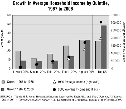
In this graphic, we display growth in household income divided into two periods of equal length: 1967 to 1986 and 1987 to 2006. Results for five population segments of the U.S. are shown as well as the top 5 percent of households, which are included in the highest quintile category.
In the early part of this 40-year period, the income of the lowest fifth of households grew at a rate of almost 20 percent, greater than that of the second and third quintiles but lower than the growth experienced for the richest quintiles of the population. In the second half of the period, the lowest fifth saw income growth shy of 10 percent and the top fifth income growth of 32.2 percent with the richest 5 percent seeing their incomes grow by nearly fifty percent (48.4%).
In the early period, policies of income distribution clearly favored the lowest reaches of society far more than did the policies followed in the second period charted. The poorest quintile of households saw their incomes grow 19.9 percent during the period 1967 to 1986 but the growth rate dropped by more than half (to 9%) for the period 1987 to 2006. In both of these periods, the “working poor” which may be represented by the second fifth of households, saw the slowest growth rates. The middle class—third and fourth quintiles—didn’t fare well either, in terms of maintaining their income growth rates. In the first time period charted, the middle class saw income growth rates of 17 to 26 percent over the period. These rates fell to 9 and 14 percent respectively in the second period. Meanwhile, the wealthiest among us maintained a robust income growth rate in both periods.
In the second half of this period, those with more grew wealthier. The richest quintile saw their incomes grow at least twice the rate of the lower 80 percent of households and in the case of the poorest quintile, the highest quintile outpaced its growth by 3.6 times. Income growth of the richest 5% of households went from 31.3% in the 1967-1986 period to 48.4% in the 1987-2006 period. Average income moved up for all groups in constant, inflation-adjusted dollars, but it leaped for those who were making the most.
Four recessions marked the 1967-1986 period. This period included the darkest days of the Vietnam war, the resignation of a president, an Arab oil embargo, and the Iranian hostage crisis. The 1980s began with the election of Ronald Reagan, brought to power by a resurgence of conservative inclinations. The Berlin Wall fell. The 1980s are now remembered as the years of the “Me Generation” and by phrases like “Greed is good.” Children were playing Pac Man as the new computer age dawned; “Apple” no longer simply meant a fruit. This period then rapidly morphed into the age of the Internet.
The 1987-2006 period saw two brief recessions (1990-1991 and 2001-2002). Our timeframe does not include the more serious recession that began in late 2007. The current recession is likely to have an important impact on all income groups. However, as the lower income households have seen far less growth in income over the last two decades (8 to 9% versus 32 to 48%), they are in a far more vulnerable position in terms of being able to weather such economic turmoil. In fact, during the period 2001 to 2006 the bottom three quintiles of households saw their inflation-adjusted incomes drop from 0.7 to 1.7 percent.
As the nation enters what appears now to be a prolonged downturn, starting in late 2007, incomes are likely to contract across the board. How the distribution of this income decline plays across the quintiles of population is yet to be seen but if recent history is any guide, the poor will be hit far harder then the wealthy as the recession works its way through the system.
Source: U.S. Bureau of the Census, Current Population Survey, “Share of Aggregate Income Received by Each Fifth and Top 5 Percent of Households (All Races): 1967 to 2007,” 2008.
Will Women Outnumber Men?

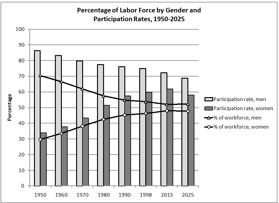
The chart above shows the percent distribution of the workforce by gender. Also shown is the labor force participation rates by gender for 1950 to 2025. Until 2015, the participation rates and, consequently, the share of the workforce has increased for women. In the same time period, the participation rates and share of the workforce for men have dipped. After 2015, the men’s participation rate is expected to continue to decrease. The women’s participation rate is also expected to decrease, but at a slightly faster rate than the men’s. As a result, the men’s share of the workforce is projected to increase and the women’s share is projected to decrease, thereby reversing the trend of the past 65 years.
The decrease in men’s participation rates can be partially attributed to the aging of the population. The availability of Social Security benefits made it possible for more men to retire after age 65. During the 1970s, Social Security payments were relatively high due to over-adjusting for inflation. As a result, even more men over age 65 retired during this period than in the 1960s. When those aged 62 and older became eligible for Social Security, more men retired from the workforce. By 1994, only half the men 62 years and older were in the workforce; in 1970 the ratio was 75 percent.
The change in the Social Security Act of 1960 made those under age 50 eligible for disability payments. This has been attributed to the decrease by 4.3% in the labor force participation rate of men aged 25 to 34 during the years 1960 to 1998. A greater availability of pensions also contributed to the reduction of men’s participation in the workforce.
The increase in women’s participation rates coincided with the modern Women’s Rights Movement. More women entered the workforce at younger ages and stayed in the workforce after their children were born. From 1980 to 2000, the participation rate for those women with children under 18 increased by 16.3%. Those with children under age 6 increased their participation rate by 18.5%.
More women are now heads of household and sole support of their families. In 1995, nearly 28% of all households were headed by women, 16.3% of which were headed by single women — a striking difference from 1950. In that year, the total percentage of households headed by singles was 9.3%, with only a fraction of that headed by women.
After 2015, the participation rate for women is expected to decline. This has to do with the increasing diversity of the workforce and the different participation rates of each race and ethnic group. Hispanics are expected to have the highest growth rate in the working-age population, but the participation rates for Hispanic women are the lowest among the top ethnic groups. Meanwhile, the white, non-Hispanic working-age population is expected to have the biggest decrease, but this group has the highest female participation rate. Therefore, the aggregate labor force participation rate for women is projected to decrease.
During this time period, the men’s aggregate participation rate is also expected to decrease, but at a slower rate than the women’s: Hispanic men have a high rate. This helps to offset the decrease in the participation rates of white, non-Hispanic men. As a result, the men’s share of the workforce starts trending upward, while the women’s share starts trending downward.
The next panel discusses gender differences in employment during the past 25 years.
Sources: Fullerton, Jr., Howard N., “Labor force participation: 75 years of change, 1950-98 and 1998-2025”, Monthly Labor Review, December 1999. Bureau of Labor Statistics. U.S. Department of Labor. “Table 6. Labor force participation rates of women by presence and age of children, March 1980-2000”, Report on the American Workforce 2001. Washington D.C.: U.S. Government Printing Office, 2001. U.S. Census Bureau. “Table 1. Projections of Households by Type: 1995 to 2010, Series 1, 2, and 3” Retrieved December 5, 2001 from http://www.census.gov/population/projections/nation/hh-fam/table1n.txt. U.S. Census Bureau. “Historical Census of Housing Tables – Living Alone.” Retrieved December 5, 2001 from: http://www.census.gov/hhes/www/housing/census/historic/liv-alone.html.
Are Women Better Able to Weather Economic Storms?

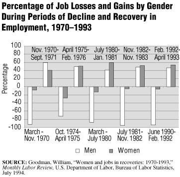
The chart above shows the percentage of job losses and gains by gender and by periods of employment decline and recovery from 1970 to 1993. The data used to create the chart include only non-farm employment. They do not include self-employment.
In every economic recovery since September 1971, women have gained a larger percentage of the newly created jobs than men have, even though men have consistently lost most of the jobs during times of economic downturn.
Most of the jobs lost during the economic downturns have been in industries that are easily affected by the ups and downs of the economy, such as construction and manufacturing. Men, traditionally, have held most of these jobs. On the other hand, many of the jobs that are traditionally held by women continued to grow during the last economic downturn and gained even more during the economic recovery. These jobs include health care occupations, social services, and public school occupations. The following table shows the percentage of men and women in the various industries.
Approximate Percentage of Employment by Gender, 1993
| Industry |
Men (%) |
Women (%) |
| Construction |
90 |
10 |
| Manufacturing |
67 |
33 |
| Health care |
18 |
82 |
| Social services |
22 |
78 |
| Local public schools |
30 |
70 |
In an economic downturn, the goods-producing sector and those industries that deal with that sector, such as retail trade, are the ones that lose the most jobs. Even when there was a recovery, the manufacturing industry still continued to lose jobs. This was due to automation, foreign competition, and cutbacks in government and commercial contracts.
While people are less likely to buy goods during an economic slowdown, there is always a need for health care, social services, and schools. The aging of the population, the increased priority people put on health care, and the added jobs when new treatments are developed all contribute to the increase in health care and social service jobs. During the last recovery, the number of jobs in state and local government also expanded, with much of that growth in the school system.
In conclusion, overall, women are more likely to keep and gain jobs during economic cycles than men due to the types of industries that employ the majority of women. More men are employed in goods-producing industries, which are affected more by economic slowdowns, automation, and foreign competition. More women are employed in service industries and state and local government. These industries do not lose as many jobs during economic downturns and, in recent years, tend to expand the number of jobs both in downturns and recoveries.
SOURCE NOTE–This essay is one from the first volume of a four volume reference work titled Social Trends & Indicators USA, written by the staff of Editorial Code and Data, Inc. and published, in 2003, by Thomson Gale. It is being used here, by Editorial Code and Data, Inc., to do some testing of electronic data presentation.